I have seen energy ingredients in about every form they come in. I have eaten bowls of caffeinated cereal, slurped down potions from antique looking bottles, crunched them up in tasty chips and spit out their husks on supercharged sunflower seeds. The one big difference between that and Bull Tonic is that none of these interesting caffeine delivery products ever tried so hard to retain the Classic Energy Drink flavor ( tastes like Red Bull or Monster), choosing flavors like apple cinnamon or pomegranate.
Bull Tonik is one of those rare but awesome finds – at least in this country. This Spanish made fresh-pak was sent to me from a helpful friend in the UK, Shame it is too far away for simply hopping down to the store to buy another pak – and these great little tablets disappeared from my collection way too quickly. If you are an energy drink fan – and love the taste of Red Bull, I would definitely recommend you finding these things out. Even at overseas shipping prices, the cost of a Pack of 20 of these energy drink Condensed tablets is far less that the cost of over a dozen Monsters – around 8 dollars – and is twice as convenient to boot.
Packaging:9
One of the biggest problems with any tablet is dissolv-ability (not a real word, but close enough) . If you make the tablet too soft, it will crumble before it ever reaches the water – leaving little crumbly bits in the package. If you make it too hard, it will lay around in the bottom of the glass undissolved. This stuff is totally dissolvable in less than 30 seconds, regardless if I dropped it in a glass of gin or a glass of ice water. Really, this is a perfect way to add a Red Bull energy drink to anything, without worrying about whether or not you will end up with a glass of grit. No grit anywhere – even at the very last drop of liquid in the glass. – very very cool.
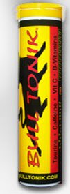
The rest of the pack is a little odd. There are 20 of them in this pack, and there is a zenergize-like freshness cap. The size and shape of the pack is great – and I love the amount of energy drink in here. What I really don’t like is the design of the pack, looking like it was printed on a color laser writer and slapped on the tube. the logo itself is also cheesy, ripping off Red Bull badly, with a bull outline and a horribly designed font choice above it. Like all energy supplements for Europe, not much in terms of ingredients listings, but it really does not need to be here. Helpfully, they do list the caffeine content, as well as all other nutritional information, which I think is a great idea. They even go so far as to list it per serving size of 2 tablets, as just one will rarely suffice. If it were not so great in terms of tablet creation and package design, this whole package would still score a very low 3 or 4, but the tablet itself is so cool it surpasses the tube’s nasty design.
Taste:7
This is a great rendition of the classic Red Bull Clone flavor. This does not really taste exactly like Red Bull or monster, but it completely fits the bill as a classic energy drink flavor profile. I tasted The carbonation in here is very nice, although it does seem to dissipate more quickly than a can does. As with most of these tablets, there was a little sodium bicarbonate flavor in here – but most of it is well hidden behind the acidity and light sweetness.
Nutrition/buzz:8
This is exactly what you would expect from a large can of energy drink. This has 160mg caffeine per serving ( 2 tablets), as much as a Rockstar, Monster or Red Bull. This also duplicates all the other substances you would find in a can of your average energy drink, including 1000mg taurine, glucoronolactone, and a full day’s supply of vitamin C as well. I enjoyed that they kept out other non-essential energy drink stuff, like inositol, ginseng or l-carnatine, keeping it simple and basic.
The buzz from this is immediate and powerful, providing a few hours buzz per tablet, while nothing intense. I was able to have 3 of these tablets in the space of an hour and it helped get over my afternoon slump, while still letting me go to sleep at night.
Website:1 http://www.bulltonik.com
Fail. The design of the site perfectly matches the tube’s label, in that it seemed like a hodgepodge of ideas and fonts – and while serviceable performing the tasks ( there is quite a lot of information, a FAQ, a place to order and a contact field) they managed to do so in the most unappealing way. And not only is the design terrible, the programming on the backend look like it was done in a free html program, even using image maps instead of buttons. For being such a great energy drink mix, I am quite taken aback at how poor their design choices are. The one good thing about the drink is there is an ordering field, taking you to a paypal store where you can order some.
I think the people who put this together really know how to make their product. Problem is, they do not know how to sell the product with a winning package design or website. Rather than do it themselves, they should hire a professional. Or, if they hired a professional – time to keep looking and get your money back.