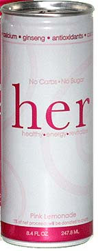
 I called HER, a new energy drink specifically designed with women in mind after reading an interesting article on it, calling itself the first energy drink marketed specifically towards women. This product came out in 2005, so it HAS been around a while. But with the new influx of energy drinks, there are quite a few now with WOMEN ONLY monikers, from Damzl Fuel to Rip It Chic.
I decided to hand the case I got to the office, in celebration of the birth of my niece. Hey, some guys give out cigars, I got HER energy drinks! (is that cool, or what) and sampled the results from the cubicle dwellers, both male and female. According to HER website, “HER will not make you “crash” or give you the jitters. The HER formula is designed to give you just the boost you need without over doing it.” With no carbs, no sugar and 5% of the profits donated to charity, this drink might be a good thing, lasting in the face of the Caffeinated Extreme Drinks appealing to the younger male market.
However, my excitement with HER was short lived. With a drink about with as much taste as a 50 cent soda and as good for me as one too, as caffeinated as a Mountain Dew and packaging right out of a better homes and gardens design book, Her is good for a cheap and slightly trashy date. For all of her high falootin standards, what with giving to charity and all, there is just not enough in this drink to have me calling on HER again.
Taste:7
One of the best things about this drink is the great pink lemonade flavor. Great in a country time lemonade way. Don’t look hard for grapefruit, you’ll find nothing even remotely related to real fruits in here. Instead, this thing is packed with artificial everything, from flavor to the super sweet Ace-K and sucralose aftertaste that lingers on and on.
Not that that was bad, just not too natural. Of the case I shared around the office, most people who drank it liked the taste well enough, thinking of it more like a mild tasty soda pop than anything energy drink related.
Nutrition:5
So Her does not think she needs a lot of caffeine in an energy drink. Instead, women don’t want caffeine in energy drinks, so she only has 45mg of caffeine in Her. Instead, you should get your energy from the other energy drink ingredients, like taurine, the B and C vitamins, ginseng, glucuronolactone and inositol. Lets not forget the definitely not healthy soda pop ingredients listed, like glyceryl abietate (ester gum) and brominated vegetable oil.
I understand their idea behind not adding that much caffeine to their drinks, but I don;t see why any person, male or female, would bother With an energy drink that does not have a kick. If you wanted a soda, you would buy a soda at a quarter of the cost..
Packaging:8
This package breaks some cardinal rules for energy drinks, but manages to pull it off quite nicely. The logo for her is in all lowercase serif fonts – which is usually a sign of not hiring a designer. Not in this case however, using the pink letters to stand out from the pack of more extreme energy drinks. The white on pink is also very subtle and clean, presenting a very accessible drink. The fonts are all very easy to understand and is overall quite lovely. All in all, this can is a great example of a package done right. And though this won;t be winning any awards for innovation, the can does the drink a service, bringing in women who would normally be turned off by energy drinks as a whole.
Website:5 www.herenergy.com
It is pretty obvious that they did not hire a web designer to build their site. IT is very pretty, but this is the work of someone who knows how to make print ads, not websites. The page here is pretty, but huge – coming in at a whopping 320k, mainly in the overuse of tables and images. The code goes even deeper into the scariness, as they built the whole pages in photoshop, then sliced them into huge images, a la 1997. Please people, just because you hire a designer does not mean they know about print, web and all other media. SO you got a site that looks nice, but it is unnecessarily huge and many of your links do not work. ( what is the concert you are promoting?) Spend the extra dollars and hire a professional to get you in the right direction – use some CSS and well coded html. It will save you tons of problems down the road.