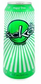
I have finally found the Socko I was looking for. A number of months ago, I had tried Socko, a great drink for Bliss Beverage in Arizona. This lovely melon flavored drink gave me the jitters, but also led to one of the worst crashes I have ever gotten from any energy drink. This was probably due to the high sugar that was in the drink, as well as my own personal factors (insomnia = bad). Well, after an exhaustive search, I came across Socko Slim, a powerful drink with the same flavor and energy profile, just without the syrupy texture and heavy sugar load to recover from.
Packaging:8
This is without a doubt one amazingly cool package. While the drink inside might be average, the packaging is what would make this drink a hit. The cool sunburst stands way out on cooler shelves – popping out in almost 3-d action. appeal to the mass audience without succumbing to the “extreme” trends set forth on the market. Bluemedia.com is responsible for the packaging – and did a really excellent package, from the design and press materials downloadable on the Socko site, to the design on all the Socko products. There were a couple issues that would really finish off the design of this can. First, no listing of caffeine – where I had to go online to www.energyfiend.com to find it. Also, they should really take more care where the cap is, so the awesome logo points outwards, rather than haphazardly in any direction.
Taste: 8
I was really enjoying the flavor of the original Socko, as well as loving their Hogan Energy as well – but the calories were an issue for me. Socko slim hits one out of the park – delivering great flavor without being heavy or syrupy. In terms of flavor, this is a great candy watermelon/cantaloupe flavor – a blend of citrus and berry that is hard to define but easy to love. The bright yellow/green is a perfect accent to the great flavors inside. This also lost the greasiness of the regular version – so this tastes fresh crisp and clean, as well as tart and as sweet as a pack of Sweethearts.
Nutrition:8
On the surface this drink looks like it is a run of the mill product, but closer inspection of the label shows some very interesting things going on. Sure it has the run of the mill 160 mg of caffeine, 2000 mg of taurine, and all the nutrients of a Monster or Rockstar, but then ups the ante with damiana extract, guarana, yerba mate, horny goat weed and ginseng. This is a small difference which makes the energy given much more than expected. This drink have me about 5 hours of happy alertness and energy – thanks to the herbs and Mate. My only issue is the use of splenda as a sweetener, rather than just using sucralose alone. Splenda is Sucralose with malodextrin and dextrose – as opposed to many drinks that use sucralose by itself. The sugar free version gets rid of the glack of High Fructose Corn Syrup however, which is a definite improvement.
Website:8
The website, like the can, was designed by powerhouse designers at bluemedia.com this company does great things with design – creating a very unique experience. I found the site to be VERY informational, but the UI is weird. The first thing people want to do is to click on these big talking buttons, but that takes them out of the site experience and into a boring html site. They also did a great job coding the site – where the info is very fast and clean, images are small, and the html behind the scenes is even downright pretty. The music on the site was used well, and did not loop for a long long time. I just wish their UI for those buttons took you out to almost a completely different feeling site.