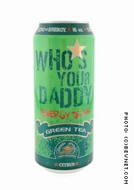
Who’s Your Daddy is a great publicly traded company, focusing on creating some great drinks and a very unique brand. I have been hoping to find this drink around me for some time, as I heard they were in my area – but could not come across them. They graciously sent me a number of their drinks to try out, so you will be seeing more of them here for review soon. If you are lucky enough to come across one, this Green Tea is a worthy buy, more caffeinated and interesting than Amp, Vault or Mello Yello.
Packaging:9
Great green distressed design. The overall layout is lovely, getting across the green tea aspects but still has enough distressed/grunge elements to let you know this is still not something you would find at your super-natural-foods store. They also do a great job with info, butting on the website, toll free number and listing the caffeine content – all of which very appreciated. While not revolutionary, the art and function hold up well under scrutiny. The only small issue I can see is very common, where they have a big blank spot on the backside of the can, where if the product was in a beverage cooler the branding might not be displayed to the consumer.
Taste:7
Who’s Your Daddy Green Tea doesn’t have any of that chalky grassy flavor that so many green teas do. While definitely green tea flavored, it does not come off as being too sour or excessively healthy. This tastes like if Lipton Brisk made a carbonated Green iced tea. This is a green tea soda pop – and while not bad for what it is, it’s not like this is tea. Instead you get hints of lemon-lime, like a caffeinated slightly tea-ish sprite. While not a smash for energy drinks, this certainly fares very very well as a soda. While very tasty, the instant tea powder and HFCS prevent this from rating higher
Nutrition:7
Actually, the comarison to Brisk tea is pretty close. Like Brisk, it is sweetened by High Fructose Corn Syrup, so all the fakiness of soda pop is definitely present. 1600mg taurine, 200mg caffeine, B Vitamins, inositol, zinc, HFCS, sodium hexametaphosphate, green tea powder and Vitamin C. Wait… sodium hexametaphosphate? This is the same stuff found in Crest toothpaste, soap and water softeners. As a preservative, is this the best they could find? I understand the need of some of these drinks to have a lower shelf life, but not sure if pumping it with this stuff is such a great thing to do…
Website – www.whosyourdaddyinc.com :5
What originally starts off as a nice clean site gets waylaid by a bunch of bad UI decisions. The site looks very pretty, even utilizing the apple-eque design of mirroring the top graphic under the bottom line to give the feeling of a reflection.While the background is a big stock-photo-grunge, it still fits into their entire motif. The overall design of the page is very lovely – with graphics poking out of frames and the entire scheme of power and extreme-ness.
The site falls apart at the categories though. There is no info on the drink themselves, instead taking you to a shopping cart for each product.There is a media button, which goes to a page where you can see a dozen ads overlapping and no interactivity at all. Same goes for nightlife and distribution – where a whole lot of information could be given, but instead we get one big jpg. The news page takes you off to their yahoo finance page – where yahoo does all the work for them. Their links page even has a link – back to their own site in a new window (wut??) This is also the only way to get to their blog, kingofbloggers.com – which does a much better job promoting themselves than this completely lacking website. Their code still shows Macromedia Dreamweaver tags all over the place. The size of the site is big for no reason – where their background image is over 250k by itself. These are OK missteps for a company where the drink is the focus – and getting a website of a decent quality itself is a challenge. But to hire an outside company and still have half a meg size and categories that mean nothing and can’t even tell you the nutrition information is pretty inexcusable. LiveCastMedia might have made it look pretty, but for all intent and purposes this site is completely useless.